


How I Knitted the Eat the Rich Hat
In this post, I discuss my design process for the Eat the Rich beanie. The pattern is available as a PDF download at the end of this article.
I originally wanted to publish this pattern in time for the inauguration of the 47th president of the United States, but life—or rather death—got in the way. My dad passed away at the beginning of January and I spent the rest of the month in Canada getting his affairs in order. Anyway. Here we are with a few weeks left of winter while things get crazier every day.
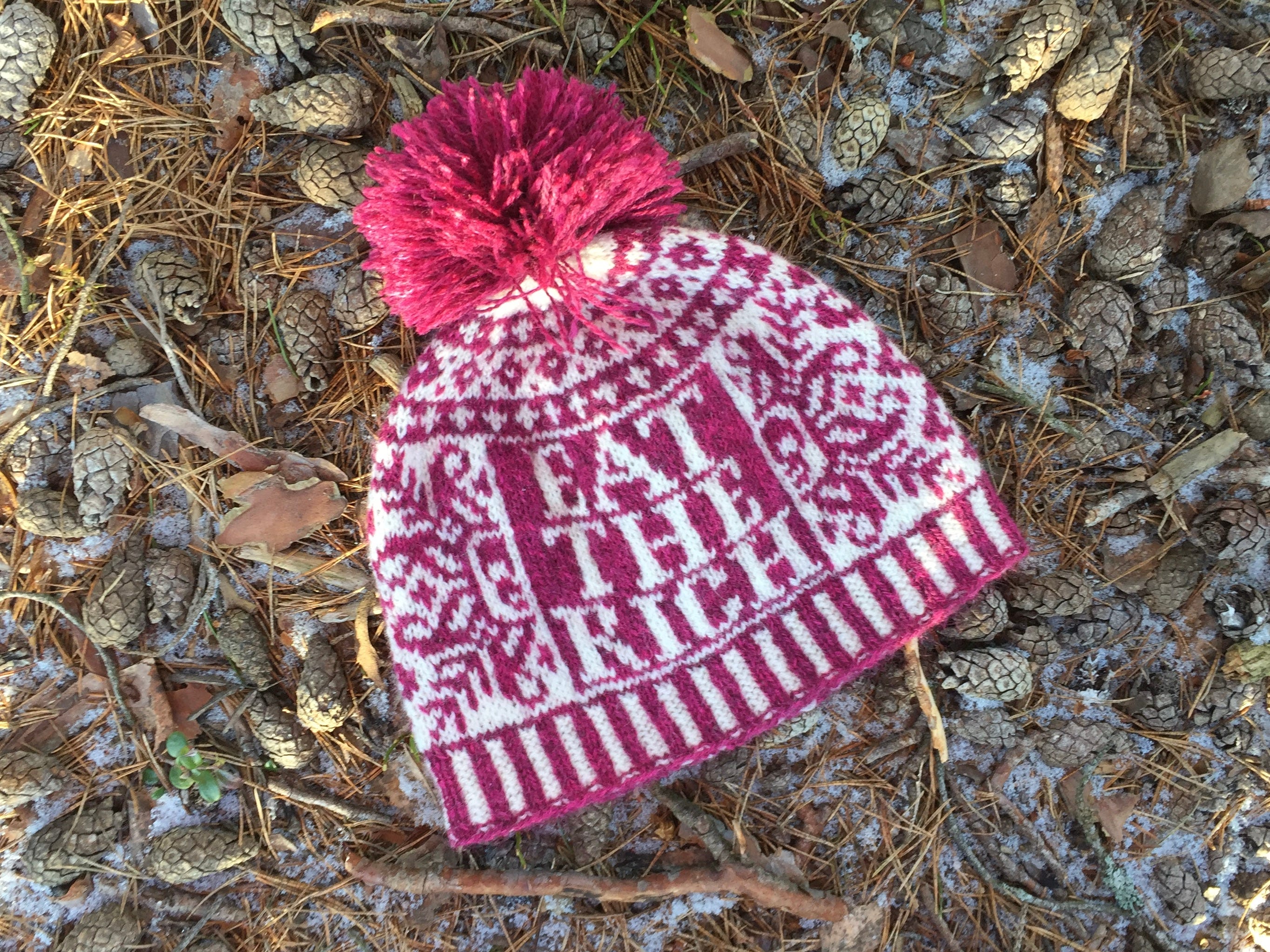
The 3D beanie was my first foray into craftivism. I enjoyed it, and the overwhelmingly positive reaction to it surprised me. However, it was a reaction to a specific event that has already been largely forgotten as the news cycle grinds on. For this new design, I wanted to express a more durable sentiment. To this end, I spent altogether too much time browsing organized labour slogans on Wikipedia before changing tack and settling on this oldie but goodie: Eat the Rich, a phrase that can (supposedly) trace its heritage all the way back to Jean-Jacques Rousseau and the French Revolution. It’s short, punchy, and—unlike Delay, Deny, Depose—unambiguous.
If you’re interested in the design process, keep reading! If you just want the pattern, skip to the end where a PDF is patiently waiting for you.
Design Considerations
I initially experimented with wrapping the words around the brim—just like in the 3D hat. However, I soon realized that Eat the Rich worked better as a block of text. This was just as well since I wanted this design to distinguish itself visually from 3D.

Early on in the design process, I settled on the idea that this hat should feature a traditional Scandinavian motif juxtaposed with the not-very-traditional exhortation to eat the rich. Much to my disappointment, my attempt to adapt the style of Swedish Ullared sweaters did not work out. These garments usually feature a check pattern with diamond motifs on the cuffs along with a placket on the front that displays the wearer’s initials and the year in which the sweater was knitted. Sigh. It was a nice thought—and I think it would make a wonderfully subversive sweater—but scaled down to hat size it didn’t quite convince me.
Bread and roses, like the Ullared experiment, proved less than successful. I tried a number of Selbu patterns from Anne Bårdsgård’s book—variations on the “kjinntyrill,” “verhånn” and “bukkhånn” roses as well as other flower motifs—but nothing really enthused me. Then I remembered Reliquary Arts’ deathflake. I’ve loved it since it was published back in 2008, but never got around to knitting it…until now.
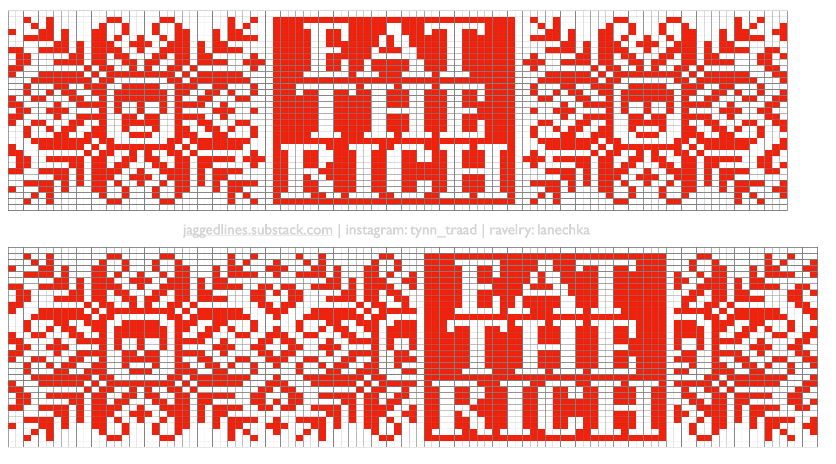
The final motif is an adaptation of the deathflake, pushed and prodded and shoehorned into place so that it fits alongside the text. I tried two different layouts for the deathflake vis-à-vis the words: as whole motifs on either side and as a split version framing the text block. In the end, I opted for the latter because I felt that the split version integrated the words and deathflakes more fully. It also provides more visual interest—the two halves of the deathflake function a bit like heraldic supporters that frame coats of arms and emphasize the shield between them. (Yes, I wrote my master’s thesis about medieval heraldry, why do you ask?)
Yarn
I knit all my stranded colourwork with Norwegian yarns and this hat was no exception. The sample features Vilje and Sølje from Hillesvåg Uldvarefabrikk. These yarns are both worsted-spun fingering weight, but still fairly lofty and the resulting fabric is lightweight and very warm. It has some bulk and is quite sticky.
Observant knitters will notice that the gauge for the 3D hat is the same as for this one, despite the fact that 3D calls for sport weight yarn. To this I can only say that the mysteries of gauge have not yet been revealed to me. So although Eat the Rich has three more stitches to its circumference and the gauge is the same as 3D, it isn’t actually larger.
Having said that, some knitters have noted that the hat ran very small with fingering weight yarn. If this is true for you, I would recommend trying a sport weight yarn at the same gauge.
Pompom or Not?
I firmly believe that (almost) all toques/beanies are improved by pompoms. I don’t, however, like the amount of yarn that goes into such flourishes; it always feels like a waste of good knitting yarn. Nevertheless, I sucked it up and made a pompom for this hat. Lacking a pompom maker, I turned instead to these instructions from Interweave, which call for two toilet rolls and as much yarn as my stingy heart could spare.
In the end, the pompom used only 12 grams and the incongruity of its demented whimsy with the text pleases me inordinately much.